01 · Branding & graphic design

A brand
people
remember.

Your logo, colours, type and the way it all works together — on screen, in print and on packaging. Designed once, used everywhere.

Start a branding project →

Concept studies

The work

Studies we made for imagined brands — so you can see how we think before we work together.

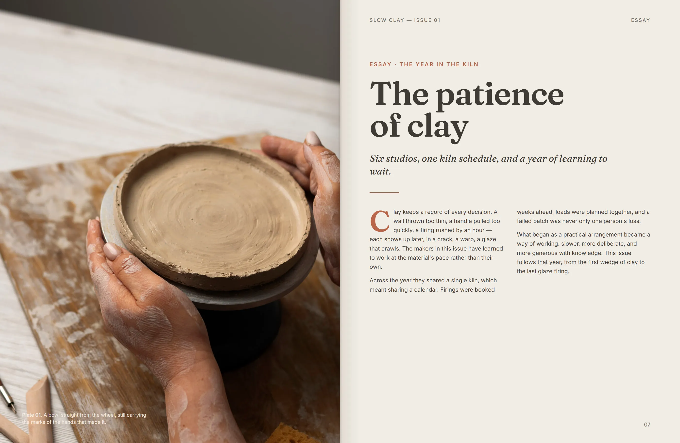
Opening essay spread with a full-bleed photograph on the left and a headline with two columns of text on the right. Concept
study

Publication concept · 01 / 03

Slow Clay

An annual printed publication for an imagined collective of independent ceramicists.
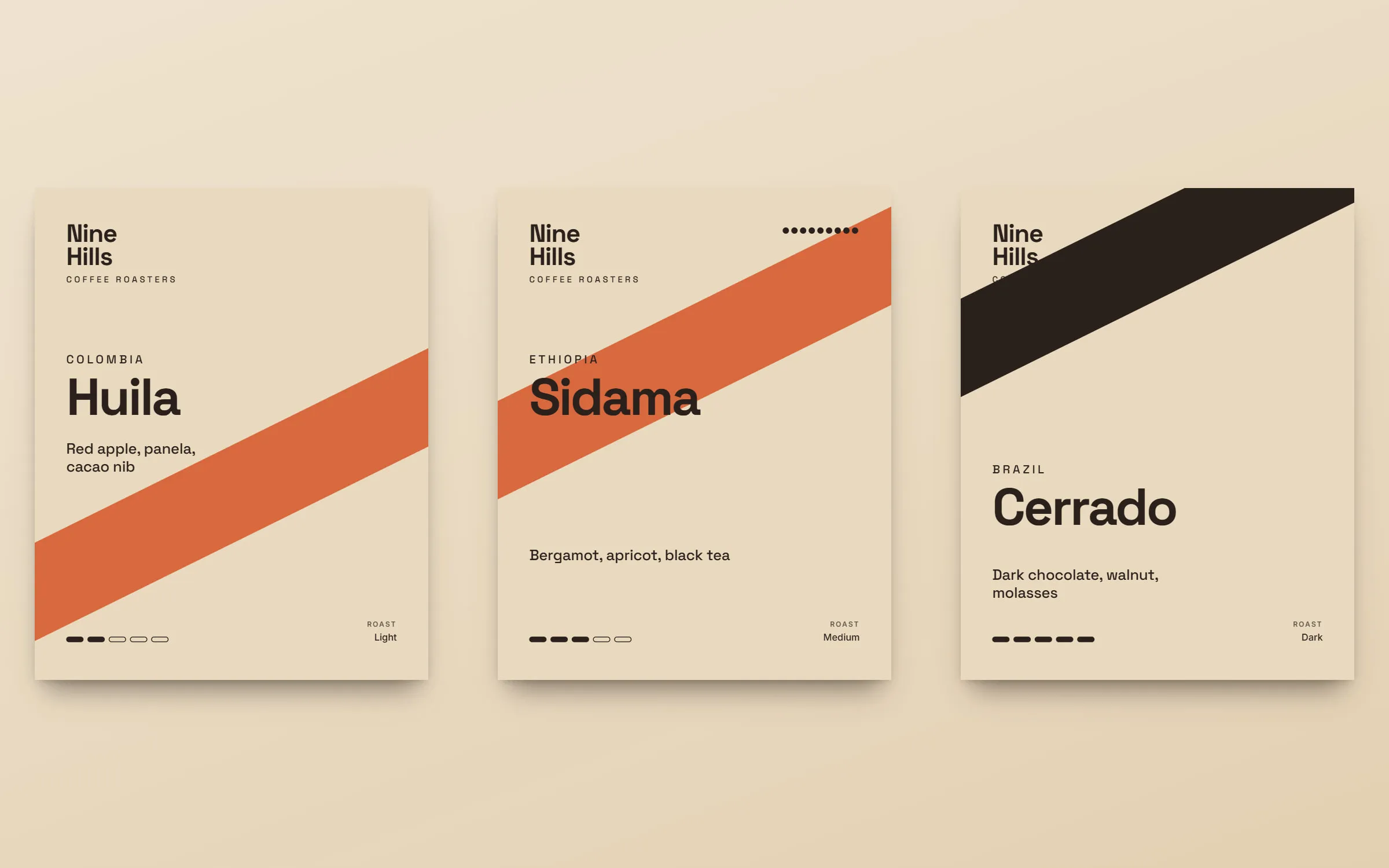
Three sleeves side by side — light, medium and dark roast — with the diagonal band at different heights. Concept
study

Packaging system concept · 02 / 03

Nine Hills Coffee

A packaging system for an imagined speciality roastery, built around a sliding sleeve that changes with each roast.
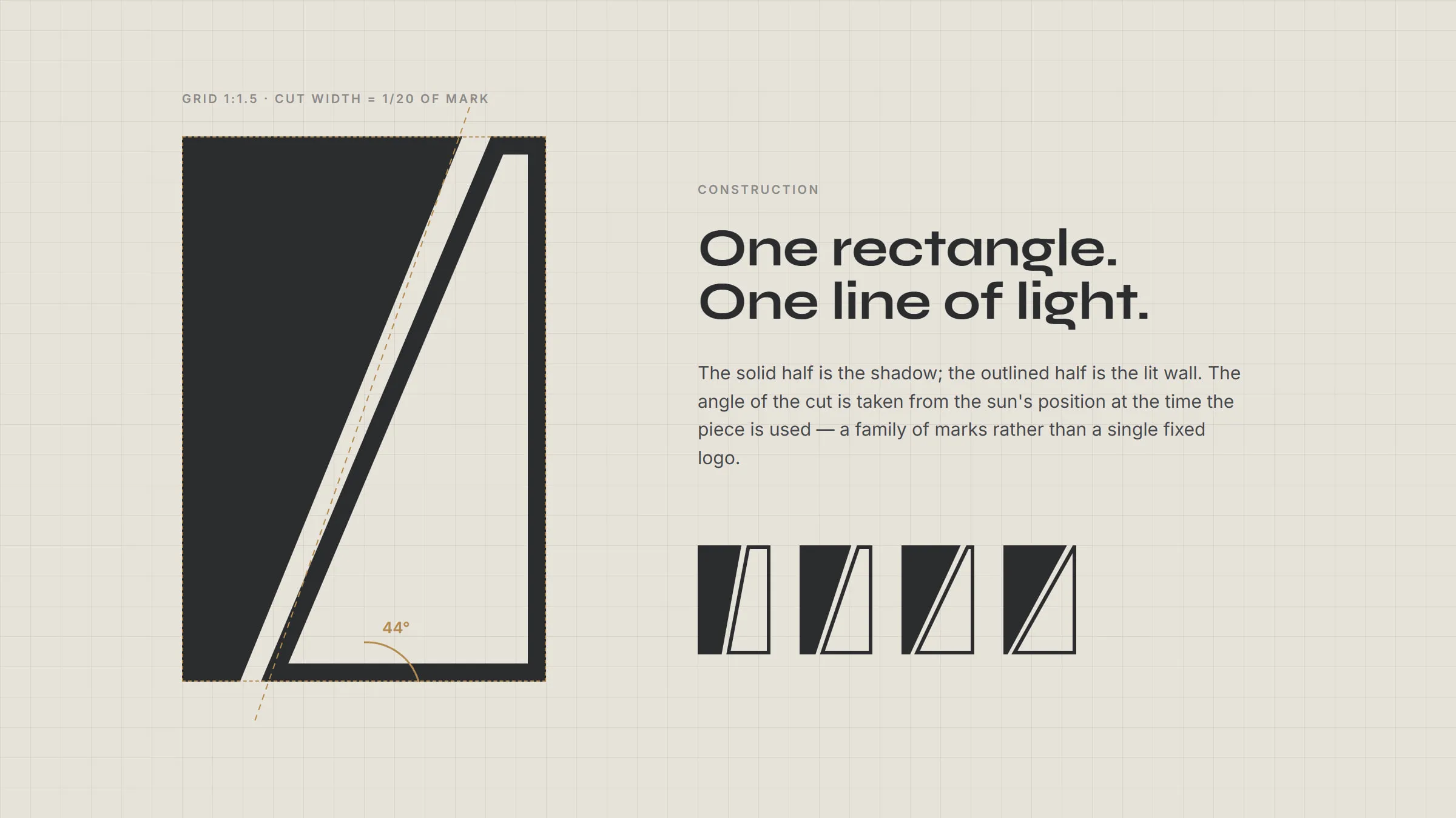
The monogram drawn on a construction grid, with the angle of the cut labelled at different times of day. Concept
study

Identity concept · 03 / 03

Atelier Oblique

A visual identity for an imagined architecture studio, drawn from the angle of afternoon light across a wall.

What's included

  • Logo & identity

    A mark that works big and small, in colour and in one ink.

  • Colour & type

    A palette and typefaces chosen to say one thing clearly.

  • Brand guidelines

    The rules in one document your team can actually use.

  • Print & stationery

    Cards, letterheads, flyers, menus — ready for the printer.

  • Packaging

    Boxes, labels and bags that look like they belong together.

  • Brand refresh

    Keep what works, fix what doesn’t, make it consistent.

How we work

  1. Listen

    We learn what you do, who it’s for and what makes you different.

  2. Sketch

    Rough ideas on paper first — then the strongest few, properly drawn.

  3. Build

    The mark, colours, type and rules, put together as one system.

  4. Hand over

    Every file and a guidelines document, ready for your team.

Good questions

How long does a brand take?

It depends on the scope — we agree a timeline with you before anything starts.

Can you refresh my existing logo?

Yes. Sometimes a careful refresh is better than starting again.

What files do I get?

Vector logo files, colour codes, the fonts to use and a guidelines document.

Publication concept · Concept study

Slow Clay

We imagined a small group of ceramic studios that wanted one yearly publication to introduce their makers, show new work and explain their process to buyers and galleries.

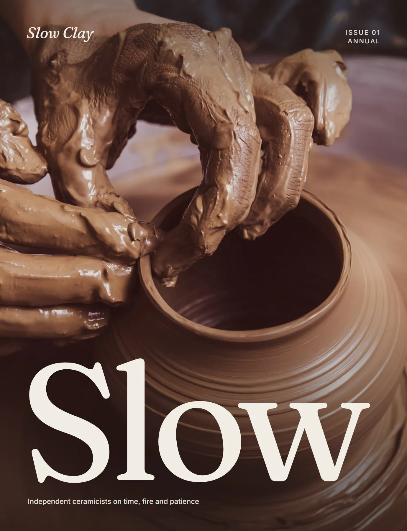
Slow Clay issue one cover — a cropped photograph of hands shaping a jar with the word Slow in large serif type.
01 / 05 Issue cover. One photograph, one word.
Opening essay spread with a full-bleed photograph on the left and a headline with two columns of text on the right.
02 / 05 The opening essay spread.
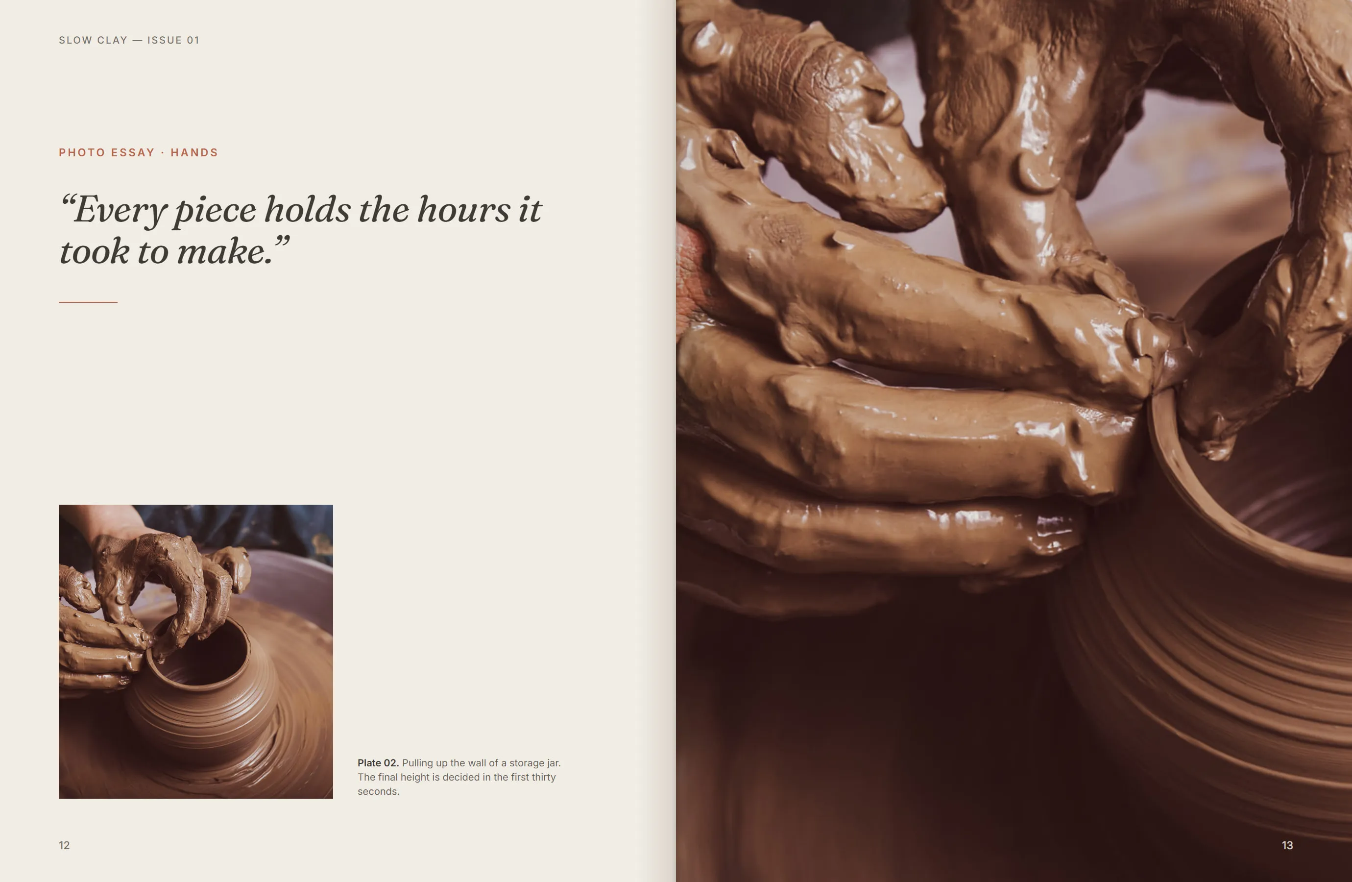
A photo essay spread showing a hand-thrown bowl in overhead light with a short caption.
03 / 05 Photo essay pacing — quiet pages between longer texts.
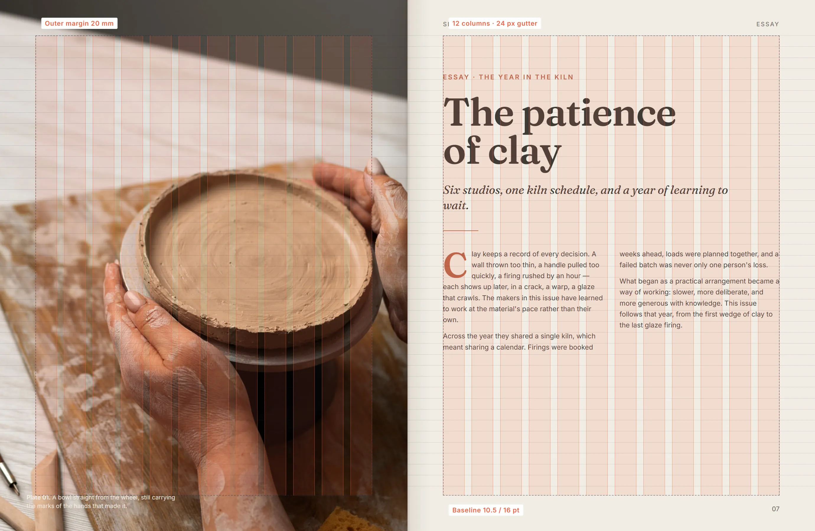
The essay spread with its twelve-column grid and baseline lines drawn over the layout.
04 / 05 The underlying grid.
Close-up of the headline and caption typography.
05 / 05 Headline and caption pairing.

Concept study. Slow Clay is a fictional collective created by Z Matchbox to demonstrate an editorial approach — it is not a client project.

  1. A grid that lets objects breathe

    A twelve-column grid with generous outer margins gives each photograph room, so glazes and textures can be read like they would be on a gallery plinth.

  2. Type with a hand, text with discipline

    A soft, high-contrast serif carries the headlines; a neutral sans handles captions and body text so long essays stay easy to read.

  3. Covers that work as posters

    Each cover is a single cropped photograph and one word, so the issue can be pinned to a studio wall as easily as it sits on a shelf.

What it shows

  • Editorial grid and typographic system design
  • Photography direction and image pacing across a multi-page document
  • Cover design that works on the shelf and as a poster
Design
Z Matchbox Company (concept)
Photography
Licensed stock photography via Magnific, used for illustration
Start a branding project →
Packaging system concept · Concept study

Nine Hills Coffee

We imagined a small roastery with a changing range of single-origin coffees and one practical problem — too many labels to design, print and keep consistent.

Three sleeves side by side — light, medium and dark roast — with the diagonal band at different heights.
01 / 05 The sleeve range. The band rises as the roast darkens.
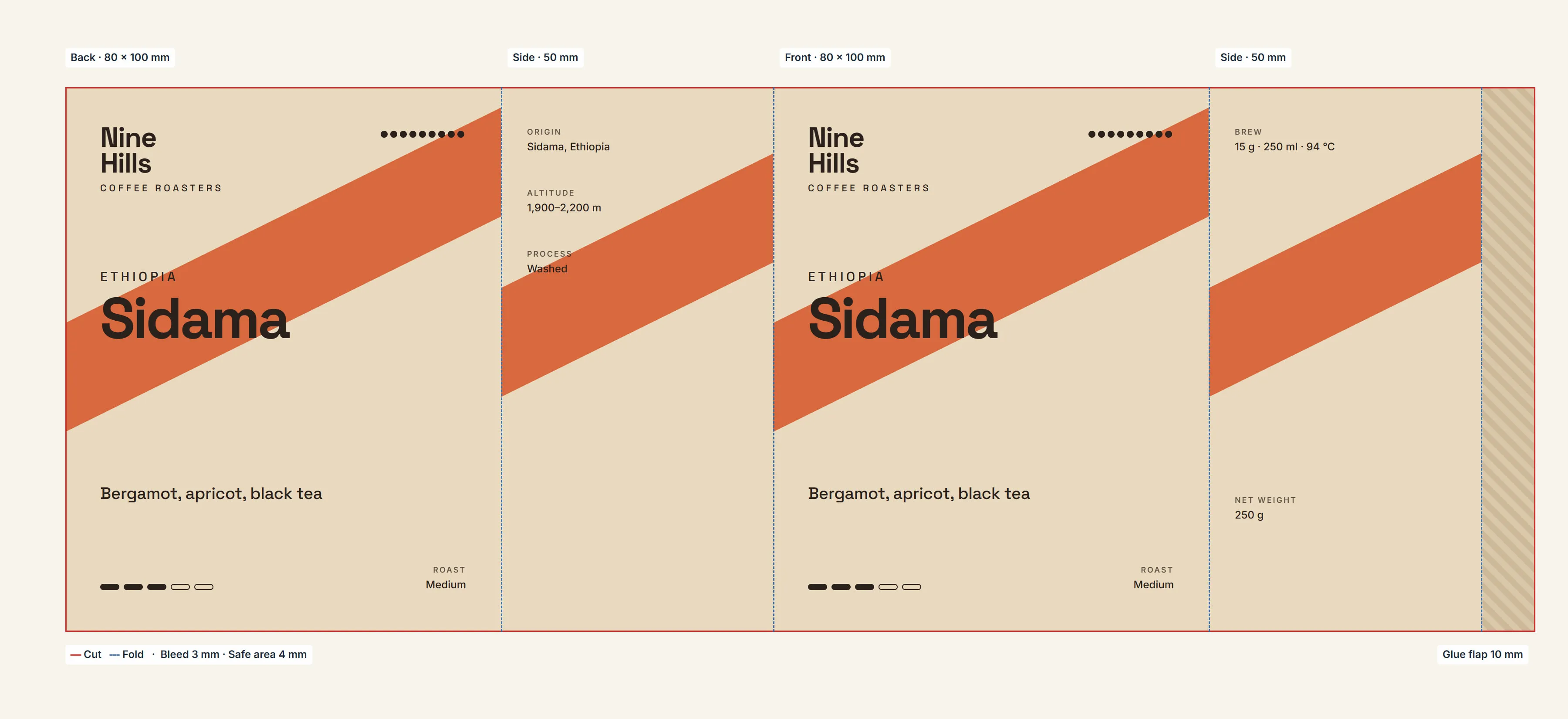
The flat dieline of the sleeve with panels, fold lines, glue area and safe zones marked.
02 / 05 Sleeve dieline with fold, glue and safe areas.
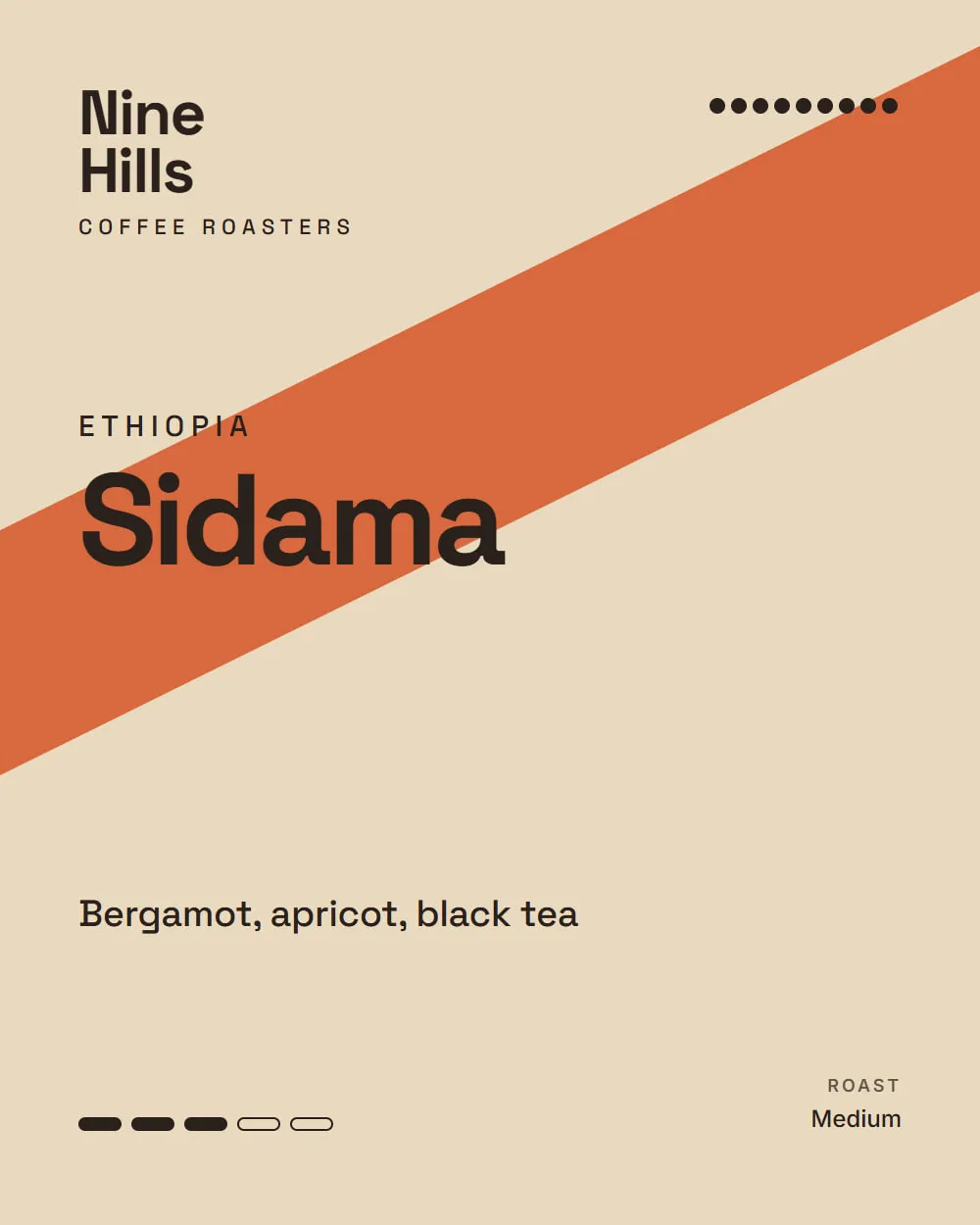
The front panel of a sleeve for a medium roast, with origin, altitude and tasting notes.
03 / 05 Front panel — medium roast.
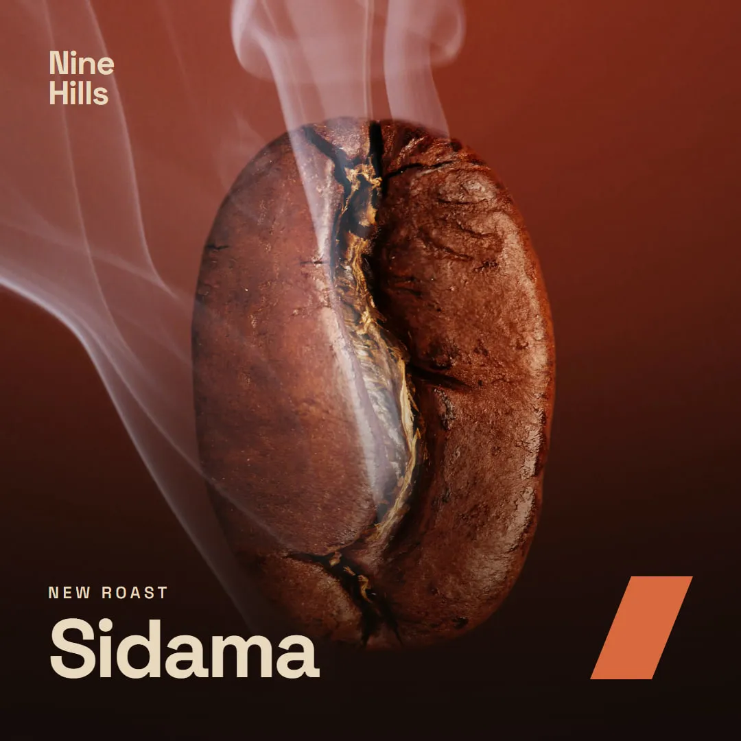
A square social post using a smoking coffee bean photograph with the Nine Hills wordmark.
04 / 05 The system extended to a launch post.
Close-up of the tasting notes and roast scale.
05 / 05 Information hierarchy on the side panel.

Concept study. Nine Hills Coffee is a fictional roastery created by Z Matchbox to demonstrate a packaging approach — it is not a client project.

  1. One box, many coffees

    Every coffee uses the same plain box. A printed sleeve carries the origin, roast level and tasting notes, so a new coffee only needs a new sleeve.

  2. Roast you can read from a distance

    The diagonal band on each sleeve moves up the box as the roast gets darker, turning a technical detail into a quick visual cue on the shelf.

  3. Ready for real production

    The dieline, glue flaps and safe areas are designed alongside the artwork, so the system is practical to print in small runs.

What it shows

  • Packaging structure and dieline planning
  • A modular label system that scales to a changing product range
  • Extending a packaging system into social content
Design
Z Matchbox Company (concept)
Photography
Licensed stock photography via Magnific, used for illustration
Start a branding project →
Identity concept · Concept study

Atelier Oblique

We imagined a two-person architecture studio known for working with natural light, and asked how an identity could express that idea without using a literal sun or building.

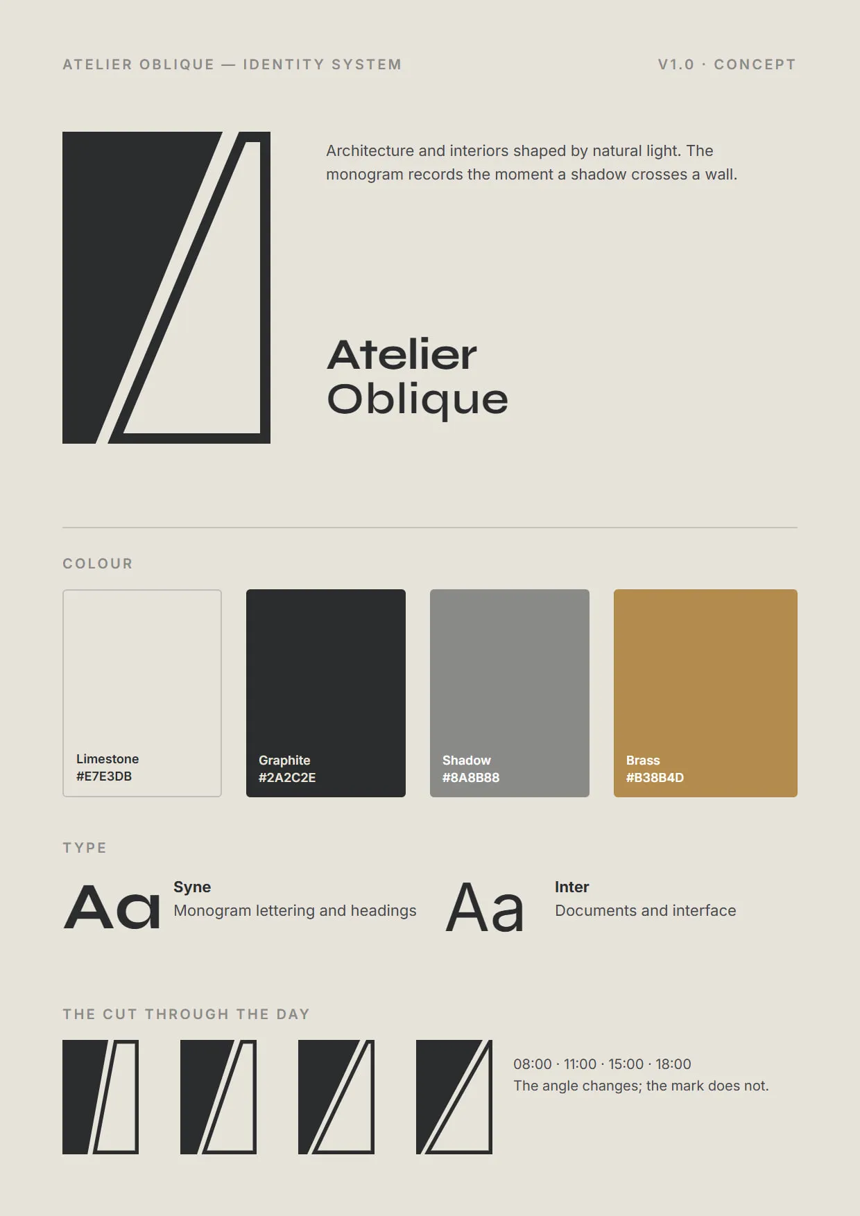
The identity sheet with the monogram, wordmark, colour swatches and typeface specimens.
01 / 05 Identity sheet.
The monogram drawn on a construction grid, with the angle of the cut labelled at different times of day.
02 / 05 Construction — the cut follows the sun.
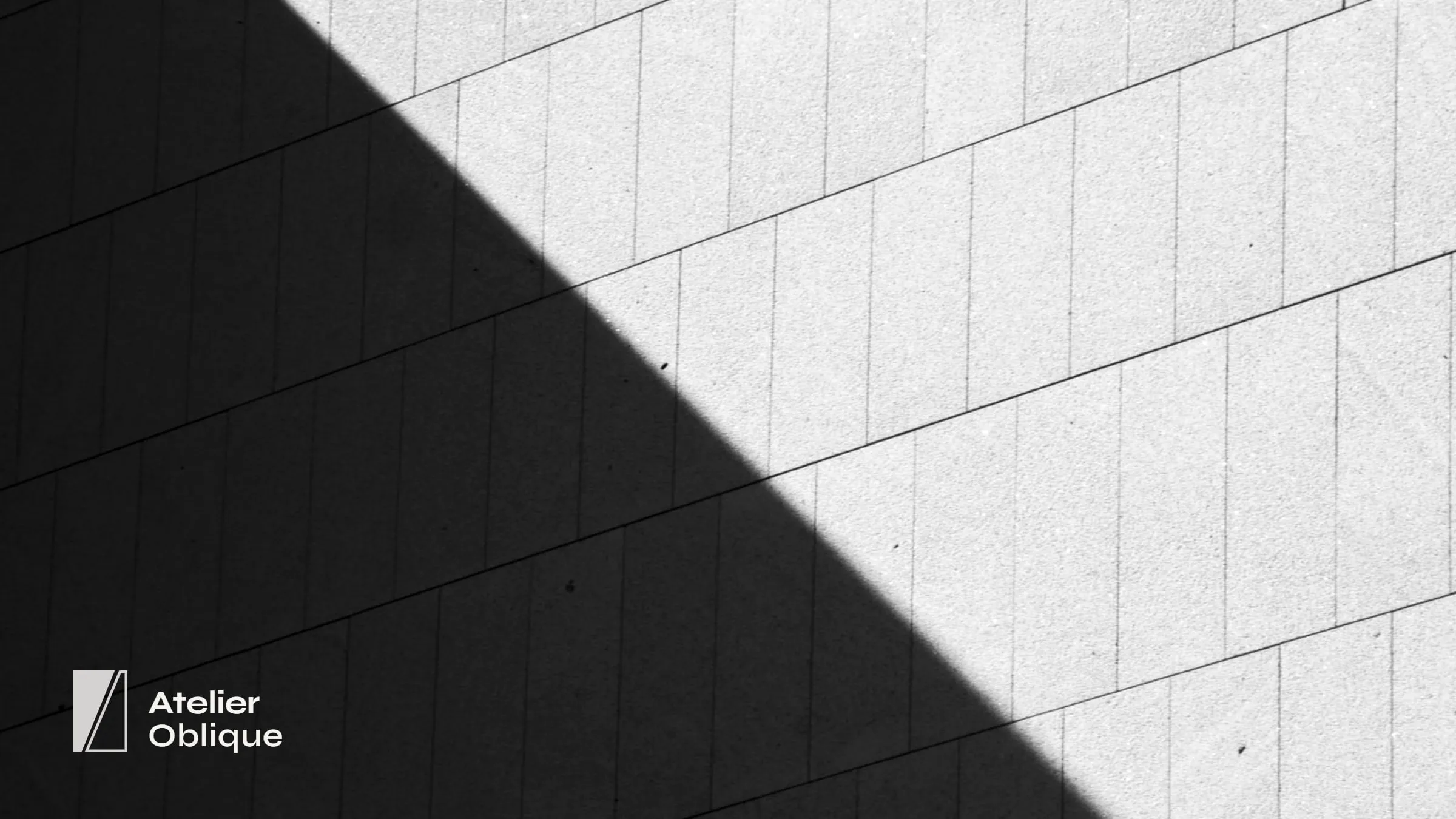
A black-and-white photograph of a facade crossed by a diagonal shadow, with the Atelier Oblique wordmark in the corner.
03 / 05 The idea in its original setting.
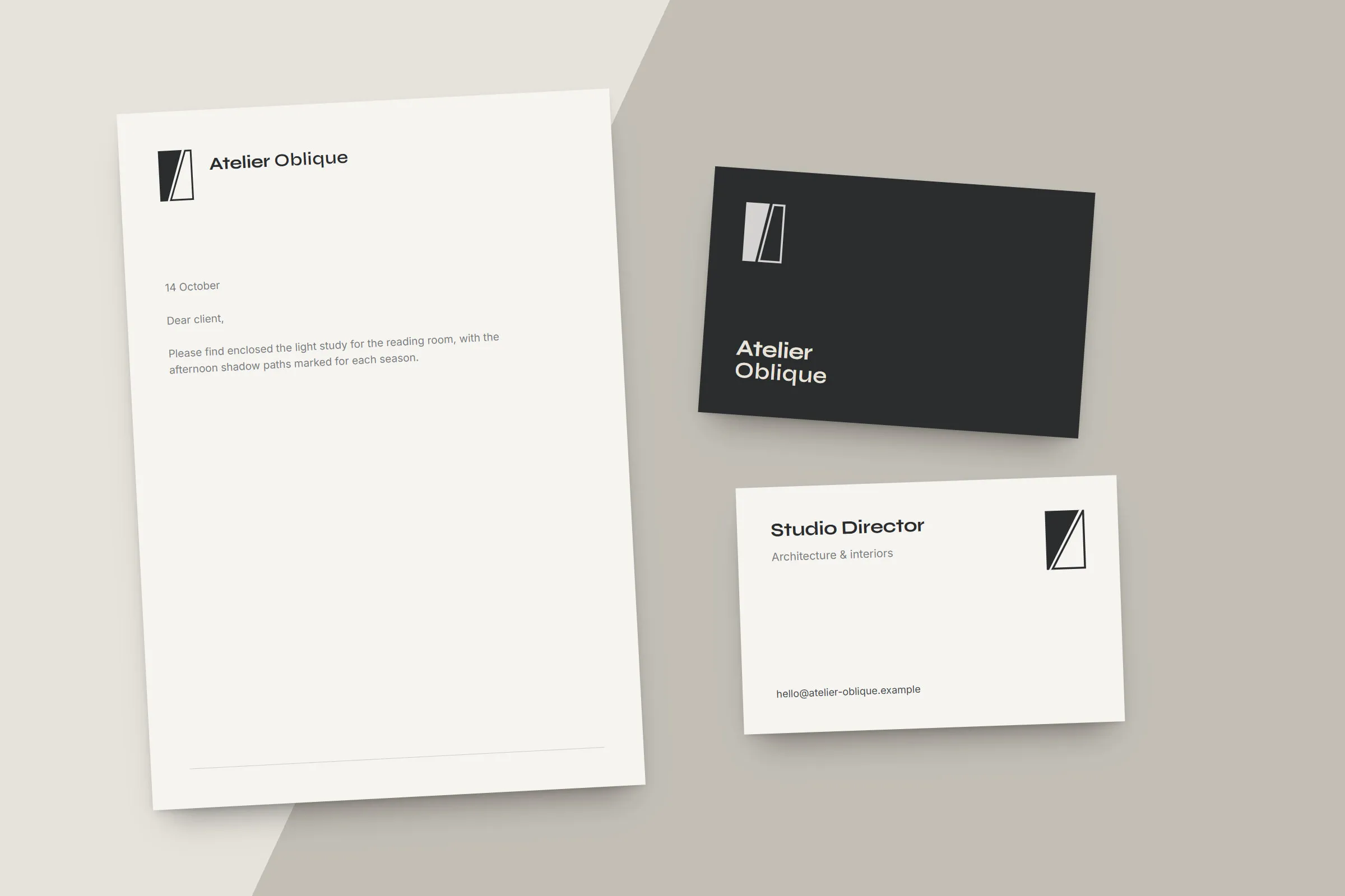
Letterhead, business card and project label laid flat, each with the cut at a different angle.
04 / 05 Stationery — a different angle on each piece.
Close-up of the monogram.
05 / 05 Monogram detail.

Concept study. Atelier Oblique is a fictional architecture studio created by Z Matchbox to demonstrate an identity approach — it is not a client project.

  1. A mark made of light and shadow

    The monogram is two rectangles cut by one oblique line — the moment a shadow crosses a facade. It reads as an A and an O without drawing either letter.

  2. A system that moves with the day

    The angle of the cut changes across applications, from a steep morning line on business cards to a long evening line on project boards.

  3. Quiet enough for the work

    Architects' own drawings and photographs are the real content, so the identity stays monochrome, precise and secondary.

What it shows

  • Concept-led logo design grounded in a single observation
  • A flexible identity system with rules for variation
  • Restrained application across stationery and presentation
Design
Z Matchbox Company (concept)
Photography
Licensed stock photography via Magnific, used for illustration
Start a branding project →